Critiquing the Crests: Texas
Not all logos are created equal, but that doesn't mean I ain't going to critique them!
Welcome back to Critiquing the Crests here on The Robinson Report! Today we are taking a look at three logos from the hockey history of the Lone Star State. Some very interesting crests have come out of this state, so do not be surprised if you see a second part to this in the future.
Our first logo on the board today is...

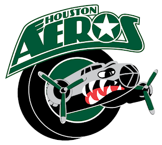
Number One: Houston Aeros (IHL and AHL; 1994-2013; Logo used from 2006-2013)
We first go to the largest city in the state, Houston, Texas, where the Houston Aeros once flew on the ice at the Toyota Center downtown. Their last logo was a bomber airplane, with classic shark paint, flying through a puck with a green center. On top of the puck is a beautifully done wordmark with wings on the 'A' and the 'O' in Aeros is a US Military aircraft insignia. Versions of this logo with blue involved in the color scheme were used from 1994 to 2002. Overall this logo is a great representation of the cities military and aerospace history, capped off with a very good recognizable design.
Final Grade: B-
---------------------------------------------------------------------------------------------------------------

Number Two: Allen Americans (CHL and ECHL; 2009-Present)
Is it July 4th already? No, it is just the Allen Americans with one of the most patriotic hockey logos made in recent memory. Pick and choose, as the 'A' that is in a near shape of a star could stand for "Allen" or "Americans". I imagine that the logo design process for this began with a png image of Captain America's shield. Jabs aside, this is a fairly sleek logo with plenty of patriotic elements, but not enough to overwhelm you with 'Murica. It's a logo that should last for many years to come, as it should be.
Final Grade: B
---------------------------------------------------------------------------------------------------------------

Number Three: Waco Wizards (WPHL; 1996-2000)
Where in the world do I begin with this? First off, this logo screams the late 1990's hockey, purple, red, teal-ish green, and gold color scheme with an over-the-top detailed designed logo. Stars big and small cover the near entirety of the logo, with a majority of them being tiny dots. Second of all, I'm actually impressed it looks very 3D as it seems to be popping out, which that kind of design was a late 90's and early 2000's design style. Even the name "Wizards" is a fairly 1990's team name that was used often during the era. This logo is majestic, outlandish, and overall just so dumbfounding that I love it.
Final Grade: A-
-Marc of The Robinson Report
Make sure to follow The Robinson Report on Twitter and Facebook for updates on future articles, news regarding minor professional hockey, and more!


Comments
Post a Comment