My Favorite Logos in Each Minor Pro Hockey League
As you will come to find out on this blog, I am a huge fan of logos. So as this is a Minor Pro hockey blog, I will be talking about logos of the various leagues. This will be the first of such articles. I will be talking about my favorite logos in the AHL, ECHL, SPHL, and FHL.
Favorite Logos of Each League
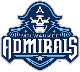
AHL: So first up is a logo of a team that has been around for several decades, but only in 2015-16 did they gain what is my favorite logo in the American Hockey League.
The team? The Milwaukee Admirals
This logo is a beautiful and modern version using combining their other two logos that the team has used in their AHL era. The uses of two shades of blue, along with the bone imagery, combines to make what it one of, if not, the best logo in the AHL. Fearsome, modern, and down right amazing.
---------------------------------------------------------------------------------------------------------------
ECHL: For my favorite logo in the league formerly called the East Coast Hockey League, its history can be dated back to towards the end of the old IHL. A modern iteration of the team and logo was born in 2012.
Have you guessed what team this is? If you said the Orlando Solar Bears, you would be CORRECT!
First things first, I absolutely love the colors used in this amazingly designed logo. The orange, purple, and teal color palette is unique in the current era of hockey. The Solar Bears do an excellent job at using this color scheme on a just as amazingly designed logo. The mascot bear in the logo is just chilling out in the sun before going down to the arena to win some hockey games, all while never taking the shades off. It's honestly my favorite logo in all of minor pro hockey.
---------------------------------------------------------------------------------------------------------
SPHL: This Southern Professional Hockey League team has been around since the 2009-10, taking over a hockey market previously home to a team with a very similar name in the ECHL. This team has won THREE President's Cups since joining the SPHL.
So what is my favorite SPHL Logo? The Pensacola Ice Flyers!

Given the Pensacola areas military involvement, a referential name was a perfect fit for their minor pro team. The name is a slight tweek from the name used in the ECHL, the Pensacola Ice Pilots. The logo uses shading of silver and white perfectly and the dark blue/navy background is a harmonious choice in the blending of colors.
---------------------------------------------------------------------------------------------------------
FHL: As with most Federal Hockey League teams, this team is fairly new. Unlike most FHL teams, however, this team is based in the Southern US. In Winston-Salem, NC, you'll find my favorite FHL logo.
My favorite FHL logo? The Carolina Thunderbirds!
The name and colors are a reference to the old Winston-Salem/Carolina Thunderbirds that notably won the first ECHL Championship back in 1989. Of course this a much more modern design that, while I'd say it isn't perfect, it's clean and simple, yet it also has a menacing vibe to it.


Comments
Post a Comment