That's a Lot of New Teams... Might as Well Rank Their Logos!
Well my goodness, I haven't seen an explosion of new teams like this in a while, maybe it was a build-up of the last couple of years? I don't know exactly, but I ain't unhappy about it. Today I want to talk about each team's name, logo, and overall branding and rank them from 1 to 7! I will also have an "Audience Score" where I had 15 people each give me their own unique ratings, the higher the rating (7 being perfect and 1 being the worst) the better. I will hope this gives a better view of the logos on a wider scale.
Note: The thoughts and opinions of these logos as written are expressly my own and no one else's, if you have your own opinions and rankings I would love to hear them!
1. MOTOR CITY ROCKERS
League: FPHL
Location: Fraser, Michigan, USA
Audience Score: 5.67 out of 7 (2nd)
In another timeline, one not so messed up from COVID, this team would've begun back in 2020. Now under different owners, the Motor City Rockers and their rockin' logo will finally make their debut this season! This logo hits all the right spots with me and then some. I am a sucker for the color scheme, one that I would always use for Create-A-Teams in NHL video games. The Rockers' name as well as the 80's hair metal-style frontman with the hockey stick/guitar hits home with my love of that era and music. The branding makes for easy marketing, both on smaller and larger scales, as it's unique enough and eye-pleasing enough to be a top brand.
2. SAVANNAH GHOST PIRATES
ZOINKS! IT'S THE GHOST PIRATES! Not only a new team but also a brand new market for minor pro hockey! What a branding to make your debut into the sport with. The Ghost Pirates' name comes from Savannah's title of being America's Most Haunted city. The sea specter's unique color scheme, design, and name are oddly breath of fresh air, extra strange coming from a ghost. Little details such as the hockey stick crossbones on the hat to the "Savannah" on the logo being a part of a tattered flag make this logo the top Audience Pick of the bunch. The audience gave this logo 7 of the 15 first-place votes.
3. BÂTISSEURS DE MONTCALM
League: LNAH
Location: Saint-Roch-de-l'Achigan, Quebec, Canada
Audience Score: 4.27 out of 7 (4th)
This logo is absolutely BUILT... because Bâtisseurs is "Builders" in French of course. Seriously though, this logo is so detailed and well-done, and it really sets itself apart from many of the other logos in the LNAH. While not much color is used, using only red, black, silver, and white, the logo creator(s) did an excellent job in making this logo stand out and look absolutely menacing. Now while the details are great, I do believe that sometimes having it so detailed can end up being a negative, but I think it works well enough in this instance. If the LNAH continues to expand, I hope for more logos like these, and fewer of the roundels...
4. COACHELLA VALLEY FIREBIRDS
League: AHL
Location: Palm Desert, California, USA
Audience Score: 4.4 out of 7 (3rd)
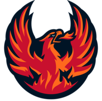
Now I love the expansion of minor pro hockey, but I don't think I ever expected to see a day where Coachella has a minor pro team, and one with a pretty dang good logo too. I do appreciate the lack of monochrome colors in the logo, makes it stand out more. However, I do feel the mixture of red and orange for the Firebird itself is oddly a bit too powerful. Maybe using different shades or arranging the mixture differently would help? With the dark blue as the backdrop of it too, the logo also ends up being kind of a dark logo, which I wouldn't have expected for a team named the Firebirds where you would expect the fire to be bright. Overall though, it's a solid logo and branding that holds up for now.
5. MISSISSIPPI SEA WOLVES
League: FPHL
Location: Biloxi, Mississippi, USA
Audience Score: 2.93 out of 7 (5th)
After one of the most successful strings of neutral-site games I have ever seen, Biloxi hockey has returned! The Sea Wolves are back and with a modern take on their retro ECHL design. Although maybe the wolf has gotten old in over a decade, he looks a bit gray from his old brown coat. I don't know how else to say it, but ever since this logo was shown off, I felt it just looked like a cheap knock-off of the original look. I do really like that the Sea Wolves returned and the fans of Biloxi definitely deserve it, but I do feel the logo is a bit lackluster and looks dated on arrival.
6. ELMIRA MAMMOTH
League: FPHL
Audience Score: 2.2 out of 7 (7th)
Now, I am sure if you are reading this, you are wondering why the Elmira Mammoth logo is near the bottom of my list, and also why it's at the bottom of the Audience Score. While yes, the Mammoth logo is a good mixture of sleek and detailed, and honestly a not bad color assortment either, something is off about the logo. For context, soon after the team unveiled the logo, I discovered that the Mammoth head was actually taken from a licensed stock logo. It wasn't even hard to find, as when you type in "Mammoth logo" it's the 6th thing to pop up on the image search. All they did was change a few minor details and add the "MAMMOTH" shield for the backdrop. While not a bad design, to me that shows clear laziness to not even create your own logo and is completely unacceptable for any pro hockey team to do.
7. CALGARY WRANGLERS
Audience Score: 2.33 out of 7 (6th)
*takes a deep sigh* This... this logo was actually the main cause for me to write this entire piece. It may LOOK like a Big "W", but in my own personal opinion, it is the biggest "L" I have seen in a long time when it comes to logos. How can any new fan possibly look at this logo and get "Wranglers" out of it? Maybe the Calgary Warm or the Wisconsin Flames? The little flame at the bottom of the "W" makes it that much more confusing. Yes, I know that the team is the Calgary Flames farm team and that it's based on the old WHL Wranglers, but that doesn't mean you have to shoehorn a flame in it. Also, and I fact-checked this, any Calgary Flames farm team logo in the past if they went that route of "one letter on fire" for the logo always used the city first letter for the flame, not the team nickname first letter. They could've done a sort of flaming cowboy, like what they did with Omaha back in 2005, but that apparently would've been too much effort. The logo looks like the meaning of an "identity crisis". I really hope that this logo isn't around for too long, because rarely as someone who is a self-titled "Logo Critic" do I get this genuinely mad about a logo.
-Marc aka The Prospector


.png)


.png)


Comments
Post a Comment