BREAKING: Evansville Thunderbolts Accidentally Leak New Logo!
Well, ain't this is a late-night scoop!
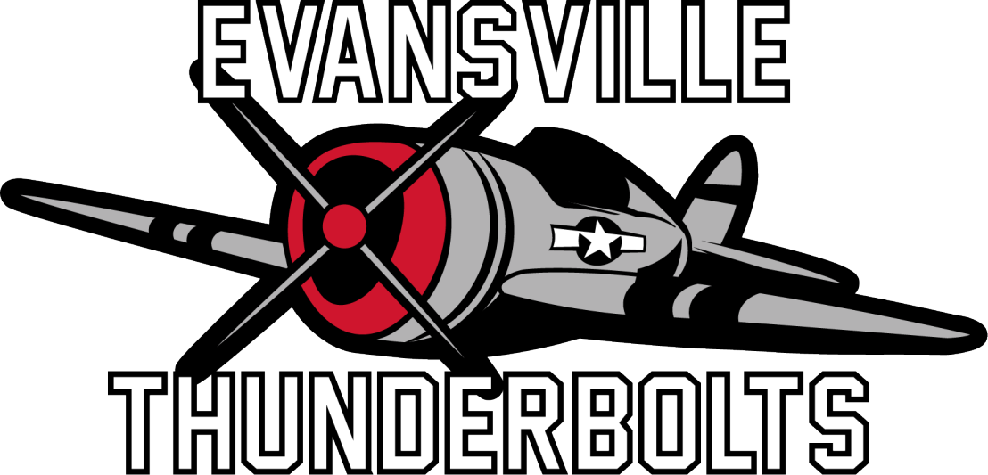
As I was winding down for the night, I saw a message questioning a "new logo" for the Evansville Thunderbolts that apparently came from their own website. I then went to check and find out and sure enough, there is a new logo and color scheme for Evansville! Seems like a website redesign hit a bit too early, or at least before the team could officially unveil their new look.
Let's quickly go over this new logo, shall we? Still going with the classic U.S. military plane as they did with their previous logo, they have seemed to get rid of the blue (and the pilot). The team has now opted for Red, Black, Grey, and White for their color scheme, which unfortunately is very similar to 3 other teams in the SPHL (Birmingham, Huntsville, and Vermilion County). The new text also looks fairly generic and looks like clip art compared to their old text style.
The logo itself just feels like far less effort went into it and makes it look far more generic than the previous logo. The plane itself isn't that bad, quite decent looking actually, but alas it's just sort of there amongst itself. So overall I would say this is a downgrade, but not the worst logo I've seen come out of this summer.
https://twitter.com/ProspectorHcky
Comments
Post a Comment