Critiquing the Crests: One and Done Logos
August 8, 2019
Sometimes, a team just fails right out of the gate. Whether it be bad marketing, poor ownership, poor location, etc. a team can fail if not operated properly. With this, you'll end up with logos that only saw a single season or less of ice time before being thrown away along with the franchise.
Today on Critiquing the Crests, we'll take a look at three logos that lasted a single season before being whisked off of jerseys for the rest of time.
Today we'll start with...
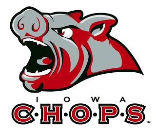
Number One: Iowa Chops (AHL; 2008-2009)
In the Summer of 2008, the Dallas Stars dropped the Iowa Stars from as their AHL farm team, and thus Anaheim came in to be the parent club. This "vicious boar head" logo was certainly a treat to see on the ice. I recall seeing it and making fun of it whenever I'd see them lose and said: "They got chopped". The color scheme is kinda hard on the eyes, with crimson, grey, and black as the team colors, it doesn't mesh together well on this logo. Personally, while I'm always sad to see a team go, I think it was good that this logo didn't get more than a season.
Final Grade: D+
---------------------------------------------------------------------------------------------------------------

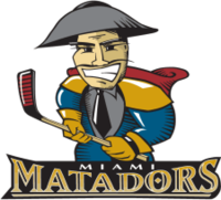
Number Two: Miami Matadors (ECHL; 1998-1999)
What in the world is the logo? It is such a mess from top to bottom. This "Matador" seems to be wearing conquistador armor, but also has a suit and tie mixed in with it? All while also wearing a cape no less and a conquistador helmet(?). This logo certainly deserved the fate of only being used for a single season. It is by far one of the most needlessly, busy logos I have ever seen and didn't translate well to jerseys either. There is honestly not much else to say other than this is one of the worst logos I've ever seen from the ECHL.
Final Grade: F
---------------------------------------------------------------------------------------------------------------

Number Three: Roanoke Valley Vipers (UHL; 2005-2006)
An honest to goodness diamond in the rough from the United Hockey League right here. I am a big fan of the color scheme, especially since they mesh it together so well. From the physical viper to the 's' in Vipers that morphs into a hockey stick, it all fuses together very nicely. Unfortunately for the team itself, it never stood a chance in a Roanoke market that at the time was bitter with previous teams leaving and joining the UHL as a whole. At least they looked good during their short existence.
Final Grade: A
-Marc of The Robinson Report
Make sure to follow The Robinson Report on Twitter and Facebook for updates on future articles, news regarding minor professional hockey, and more!
Sometimes, a team just fails right out of the gate. Whether it be bad marketing, poor ownership, poor location, etc. a team can fail if not operated properly. With this, you'll end up with logos that only saw a single season or less of ice time before being thrown away along with the franchise.
Today on Critiquing the Crests, we'll take a look at three logos that lasted a single season before being whisked off of jerseys for the rest of time.
Today we'll start with...

Number One: Iowa Chops (AHL; 2008-2009)
In the Summer of 2008, the Dallas Stars dropped the Iowa Stars from as their AHL farm team, and thus Anaheim came in to be the parent club. This "vicious boar head" logo was certainly a treat to see on the ice. I recall seeing it and making fun of it whenever I'd see them lose and said: "They got chopped". The color scheme is kinda hard on the eyes, with crimson, grey, and black as the team colors, it doesn't mesh together well on this logo. Personally, while I'm always sad to see a team go, I think it was good that this logo didn't get more than a season.
Final Grade: D+
---------------------------------------------------------------------------------------------------------------
Number Two: Miami Matadors (ECHL; 1998-1999)
What in the world is the logo? It is such a mess from top to bottom. This "Matador" seems to be wearing conquistador armor, but also has a suit and tie mixed in with it? All while also wearing a cape no less and a conquistador helmet(?). This logo certainly deserved the fate of only being used for a single season. It is by far one of the most needlessly, busy logos I have ever seen and didn't translate well to jerseys either. There is honestly not much else to say other than this is one of the worst logos I've ever seen from the ECHL.
Final Grade: F
---------------------------------------------------------------------------------------------------------------

Number Three: Roanoke Valley Vipers (UHL; 2005-2006)
An honest to goodness diamond in the rough from the United Hockey League right here. I am a big fan of the color scheme, especially since they mesh it together so well. From the physical viper to the 's' in Vipers that morphs into a hockey stick, it all fuses together very nicely. Unfortunately for the team itself, it never stood a chance in a Roanoke market that at the time was bitter with previous teams leaving and joining the UHL as a whole. At least they looked good during their short existence.
Final Grade: A
-Marc of The Robinson Report
Make sure to follow The Robinson Report on Twitter and Facebook for updates on future articles, news regarding minor professional hockey, and more!
Comments
Post a Comment