Critiquing the Crests: Before the NHL
I love Hockey logos. Every fan roots for a team and these icons of hockey are the crests that represent every cheer, every cry, and every second we pour into our love for the game.
Today on The Robinson Report, we'll take a look at three logos that were once used in seasons past, with each logo being the last logo these markets seen before the NHL came calling.
Welcome to Critiquing the Crests.
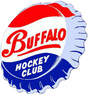
Number One: Buffalo Bisons (AHL; 1940-1970)
This is one of the more...blatant adverts in a sports logo I've ever seen. I should give some background on why this logo for the Buffalo Bisons is some Pepsi-Cola bottle cap. Fairly simple honestly, as in 1956 the Bisons were bought by the owner of the local franchise Pepsi-Cola Ruby Pastor. Pastor changed the teams' logo to fit with the Pepsi-Cola branding.
One of my biggest gripes with this logo (outside of it being a giant advertisement) is that it has nothing to do with "Bisons", not even a single hint of the word nor animal is present on this crest. The stylized "Buffalo" wordmark on the bottle cap has become famous in its' own right. Unfortunately, I can not look past the Pepsi-Cola advert that was once plastered on the front of every Bisons jersey.
Final Grade: F
---------------------------------------------------------------------------------------------------------------
Number Two: Raleigh IceCaps (ECHL; 1991-1998)
Before there were storm surges and pigs roaming around an arena in Raleigh, NC, you had a frozen wordmark. The IceCaps are meant to be short for Ice Capitals, as Raleigh is the capital of North Carolina, which was represented far better on their original logo.
On this logo, though, it makes the IceCaps name seem to mean the actual landmass of ice instead of the previous mentioned Ice Capitals. A frozen wordmark plus a puck with Raleigh on the side of it is uncreative at the very best. To me, it's always disappointing to see a team downgrade its logo, and the Raleigh IceCaps are no different.
Final Grade: D+
---------------------------------------------------------------------------------------------------------------
Number Three: Nashville Ice Flyers (CHL; 1997-1998)
Last, but not least, for this inaugural edition of Critiquing the Crests, we have a very mysterious logo. Before the Predators brought NHL action to the Music City, the Ice Flyers called Nashville home for the one season prior to the start of the Predators.
Now I'm not saying this logo is outright bad, it's just the creature in the logo is very strange looking. The creature to me looks like an albino version of one of the flying monkeys from the movie The Wizard of Oz. I find the text above the creature a little funky, but not bad and it's a bit classic looking. Overall, it's a fairly okay designed logo with neat text, but with an odd unknown creature as the focal point of the crest.
Final Grade: B-
-Marc of The Robinson Report


Comments
Post a Comment