My LEAST Favorite Logos in Each Minor Pro Hockey League
So I already talked about my favorite minor pro logos, but what about my least favorites? The logos that make me question the people who designed them and sent them out for the world to see? Well let's take a look at them, shall we?
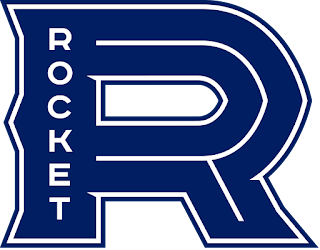
AHL: This logo is from one of the newest teams in the AHL. The Montreal Canadiens moved their AHL team in St. Johns, Newfoundland to Laval, Quebec, a suburb of Montreal. A name the team contest was held and the winning name was the Laval Rocket, named after Canadiens and Hockey legend Maurice "Rocket" Richard. While the namesake is of course legendary, the logo for the team on the other hand...

Yeah...
Not so legendary...
What is this? I know the Canadiens don't have the greatest logo themselves, but somehow their offspring is even WORSE! This logo is something I can make in Adobe Photoshop in about 5 minutes or less. The shape of the R is odd, yet bland. The word "Rocket" is in the stem of the R that is meant to represent "Rocket". I don't understand the need to put in the odd skeletal white lines inside the R. I'm sorry Laval, I know you guys have been embracing this team and loving it, but this logo needs to go back to the drawing board.
---------------------------------------------------------------------------------------
ECHL: I honestly don't know which logo I'd say is worse, so for the only time in this short series, I'll name two logos that are tied for the my least favorite logo in the league. One team is doing amazing in 2018-19, while the other is struggling near the bottom of their division. The first team in question is...
And the other team...

The Cincinnati Cyclones and the Rapid City Rush of the ECHL have the worst logos of the league.
Let's start with ol' Cincy over here, as they are the older team, yet have the newer logo. The Cyclones logo was introduced in 2014 as a replacement for their cartoon cyclone logo used for over a decade. While I do agree a change was needed, this wasn't what the doctor ordered. Whenever I look at the logo, it confuses me. Like, I understand that it's supposed to be a cyclone within a stylized C, but it just looks off and it kinda seems sterile.
Now onto the Rapid City Rush, a team who has never changed their logo since their inaugural season back in the 2008-09 Central Hockey League season. The Rush joined the ECHL when the ECHL-CHL Merger occurred back in 2014. All this logo is is a sort of stylized 'R' that's gone through a ton of thick border colors. While the colors aren't bad, it doesn't add much to the boring design. Since the logo has been around for over a decade now, maybe a logo update will happen soon for the Rush.
---------------------------------------------------------------------------------------
SPHL: So the previous logos are my least favorite because all they are is a bland and/or poorly designed letter, that's it. Going down south, however, brings us to a logo that I don't like not because it's bland, but that it has FAR too much going on.

What the heck even is this??? This team ladies and gentlemen is the Roanoke Rail Yard Dawgs. No joke on the name, especially since it takes up half the logo and is over stylized. The "Dawg" has far too much detail and shading going on for it to be coherent to me. It's just a mess! I hope they change this logo or at least clean it up in the future because this is just a hell to the eyes, especially on a jersey.
---------------------------------------------------------------------------------------
FHL: Now to the FHL, this team has recently become the most attended team in a single season in FHL history. Not exactly a hard feat given some of the arenas and the level of play in the league, but a good feat nonetheless. The market is a recent ECHL cast-off as well, but let's just say their old logo and branding was much better...

I'll be perfectly honest, this logo looks very bush/beer league. The Elmira Enforcers colors are an odd blend of neon green and gray/black, which don't look good on jerseys (seriously look up the Enforcers jerseys...). It's not a horribly designed logo, it just looks more like a drawing than an actual logo. I'll say it's a neat touch that the badge on the hat is a reference to the Elmira area code. Other than that though, it's just not a great logo for a sports team.


Comments
Post a Comment